Flexible work spaces…. and sheep

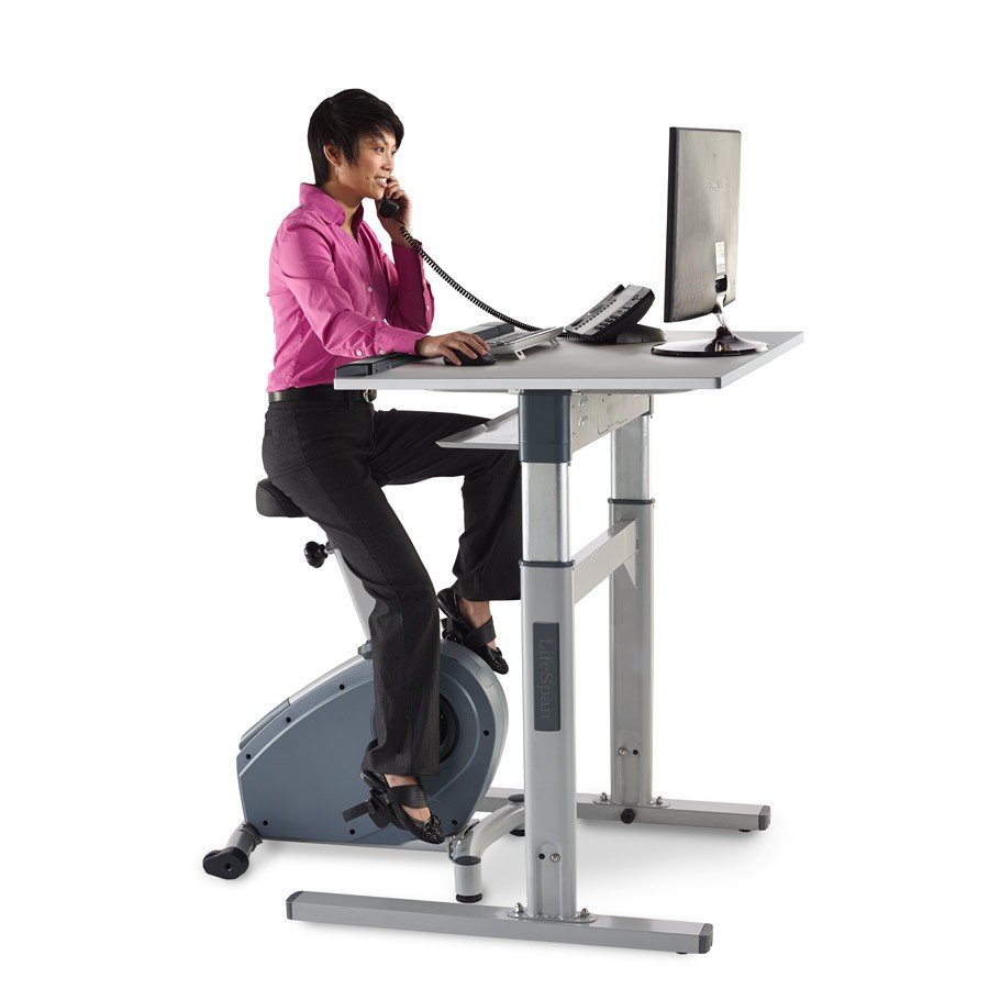
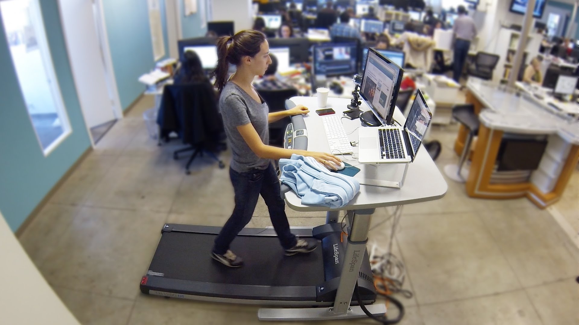
Offices are changing, the way we work is changing and it’s happening very fast. Gone are the days of sitting in the same desk every day, large corner workstations – one per person, a couple of storage cabinets each, the MD in his private office, the PA as the gate-keeper… Things have moved on. The office now is about communication, collaboration and adaptability. Offices now are fun; inspirational and exciting places to be – well at least they can be. Changes in technology mean we no longer need paper copies of everything; I can’t even remember the last time I hand wrote something. We don’t need massive desks, in fact the desk could even be a bar counter, treadmill, or bike (I kid you not – these are reality now)…  treadmill-desk

bike-desk

They might seem extremely silly, but they’re not really designed to be sat at by one person all day, in the same way that standard workstations are no longer really designed to be sat at all day. Modern office design includes soft seating for informal meetings, touchdown areas for staff that are just looking for a space to check their emails prior to “the big meeting”, private skype booths, brainstorm rooms with walls you write on, in fact different working environments for different activities, which when you think about it makes perfect sense.

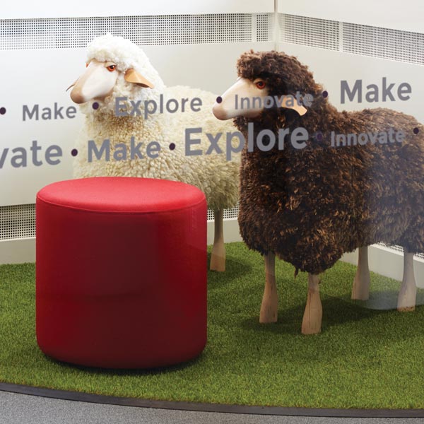
You can even get “meeting sheep”……

ewe-rangeBaaa-rilliant…..

The Touchdown Bar

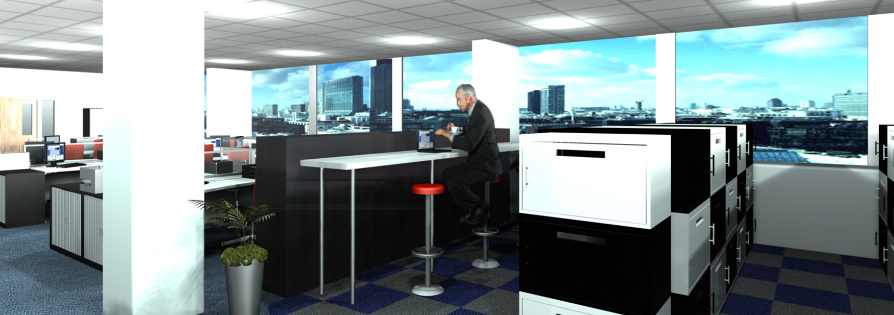
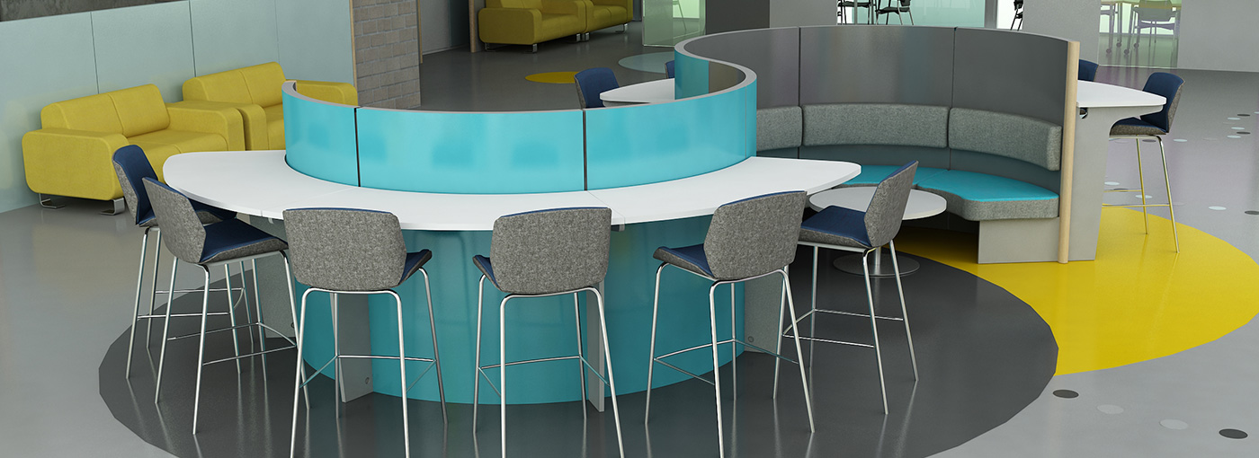
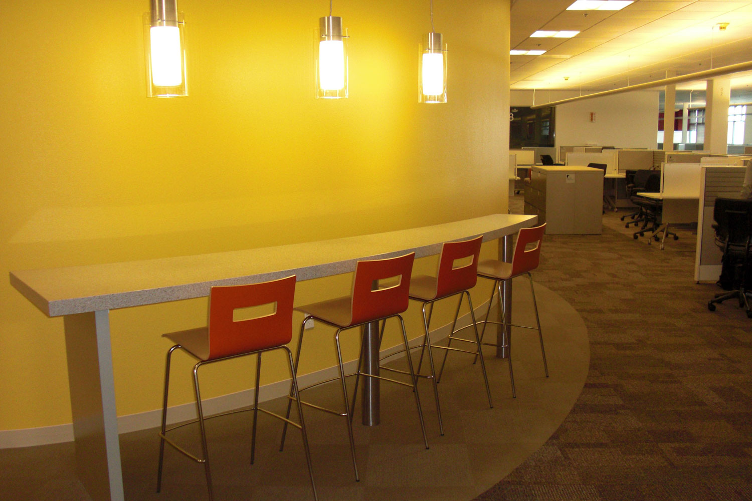
The touchdown bar is best described as a bar counter with stools. It is particularly useful in an office where you have many travelling staff, or staff that come in and out for meetings. The touchdown bar give you a workspace that allows staff to sit, connect up a laptop, do a bit of work before going into their meeting without claiming a desk space for the entire day. By using stools rather than standard task chairs you are less likely to drape your coat over the chair and thereby claim it (even when you might be out of the room for several hours). Also the stools aren’t quite as comfortable to sit at for hours on end, so anyone needing to work for several hours would be more likely to choose a hotdesk or an empty desk. This means that these chairs are great for a high turnover of people and get used in a very efficient way. They can also double as a coffee point, are perfect for informal one to one meetings, or even somewhere to eat you lunch away from your desk.

touchdown3


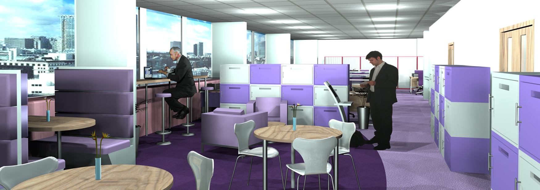
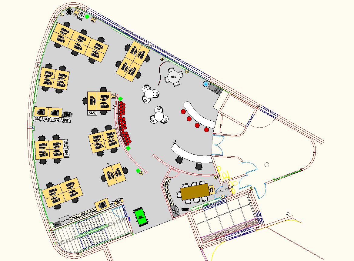
The plan above shows one of our space plans that incorporates a touchdown area near the entrance of an office we planned for a client in London. Although there is limited space and an odd shaped area available we still managed to fit in several different working environments (reception, touchdown, soft seating, cafe tables, meeting table with flexi-screen, fixed staff desks and a meeting room). This gave the client flexibility allowing staff to pick a working environment suited to their particular task.

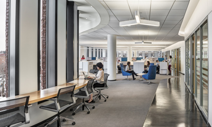
Below are some additional images of touchown areas to show how these areas work in a modern office environment.

spaceoasisBruce C Bolling Municipal Building at Dudley Squareb12-touchdowns

.

Alternative working environments

When making the most of your office space it is worth considering more than just desks. By including several alternative working environments you can give your staff a choice of how to work for different tasks and this can help encourage effective communication, better task allocation and staff management, helping to spread sales leads, encouraging creativity and  thereby improving productivity and saving the world (probably)…..

This is the first in a series of blog posts showing examples of alternative working environments for the most effective office design. Today we are looking at “The business class lounge”.

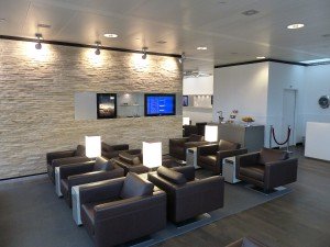
510d0f535df5b_P1010990(1)  The “business class lounge” takes its name and in fact its design directly from the airport business lounge. By giving a dedicated area that has large comfortable armchairs with plenty of space around you can create a space that can accommodate visiting staff (working as a waiting area), travelling staff that need an area to connect to the internet, do some emails or work on a presentation, or be used by your regular office staff as an area to get away from their desks for quiet work, or even as a lunch area.


images

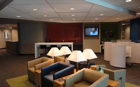
The key with this type of workspace is that it shouldn’t be used as a meeting area. By spacing the chairs out, and keeping them large and heavy they should remain in their location and therefore be used as an individual oasis in a busy office. To ensure this works obviously you do need to include enough meeting areas, but they can be a real multifunction space – doing away with the need for a waiting area for example, allowing you more space for other functions.


20140127-united-620

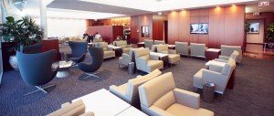
Chairs could be in your corporate colours, traditional leather for an old school gentlemen’s club look, or for a more relaxed environment bright contrasting colours, or even neons. The side table units in between each chair allow plenty of space for each user, as well as useful charge points for phones and laptops and ethernet points. Overall the business class lounge is a useful addition to the modern office. Give a shout for more information about how we can integrate ideas such as this into your space plans and office layout design

The use of soft seating in an office.

These days with rising office rentals the main request we get is for an office maximisation exercise, in other words we are asked to produce space plans that show the maximum number of workstations above all else. However, when designing an office layout it is also important to include soft seating and breakout areas too. This is not just as it is nice to have comfy seating; they act an as important tool in encouraging communication.

In an office design where there are just desks the staff would tend to have casual conversations only with the staff that they sit opposite or adjacent to, meaning that the sales staff chat with the sales staff and the marketing staff chat with the marketing staff. However by introducing breakout areas with comfy seating and perhaps a coffee machine you are encouraging staff to remain in the office during their breaks and are much more likely to sit and chat with someone from another department. This could mean that that important sales lead could be picked up from a chat between someone from sales and marketing.

Soft seating also helps you to put more desking into an office design without it looking like a chicken run. It visually breaks up the space and that in turn allows you to make the desk areas denser. They also help with keeping noise levels down both by breaking up the runs of desks, and also by giving staff a space to chat (rather than shouting over desks). They can be used for informal meetings, which can free up a meeting room, and can make meetings feel less formal (it’s a lot less threatening to be called for a chat on a sofa, than to be called into a meeting room).

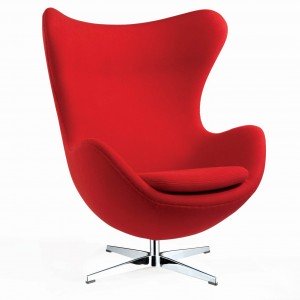
Finally soft seating is often the one point that you can make a design statement in a modern rented office. Often the majority of walls are glazed or covered with full height storage cabinets, meaning that you only have the flooring (which you may not want to change), the columns (if there are any) and the furniture to play with design-wise. Most desks tend to be fairly functional  and although you can choose a funky fabric for the chairs, most offices would again choose functionality over form. However a piece of soft seating can be like a sculpture in a large open plan office, and a statement piece such as the Egg Chair (see below) can make an ordinary office look like a funky modern office.

1003896_Egg-Chair-Red

A few simple pieces of furniture can transform you office design – don’t overlook breakout areas and soft seating!

So you’ve been asked to sort out your office – part 5

Here is part 5 in our guide to improving your office

Space planning-

The most important thing when space planning your office is to begin with an accurate plan of the office as it is currently. This will allow you to know exactly what you have currently (a furniture inventory), the dimensions of each item of furniture, and the size, shape and any obstructions within your office space. Once you have an “as existing” plan you can quickly see where there is wasted space to allow you to produce a much more effective office design. If your office is already bulging at the seams then it would be worth using space planning layouts to try out different furniture sizes or shapes, and this allows you to quickly establish the overall capacity of your office and ensure the most effective design.

An efficient office design has to include space for the minimum required fire escape routes, wheelchair accessibility  and there is also a requirement for a minimum of 11 cubic metres of air space per person (the height is not counted if the ceiling height is over 3m). For most offices this equates to at least 4 square metres per person, but this figure is the total space including corridors etc.

For most offices there is usually something that can be done to improve the efficiency of the layout without the need for removing partition walls. We usually produce a series of space plans starting with the minimal cost option, going through to options that change the furniture and finally options that change the partitioning. The layouts can then be costed up to give you a clear cost versus output figure, allowing you to factor office design in to your future business costs.

So you’ve been asked to sort out your office – part 4

Here is part 4 in our guide to improving your office accommodation

Efficiency of your furniture.

The first thing to decide when looking at your office furniture is are you looking to keep all, some, or none of it? If you are looking to re-use your existing furniture is it used in the most efficient layout, or do you have pockets of wasted space? Is it possible to re-use old furniture in a new way; for example , the big old corner (L-shaped) desks that were the standard 20 years ago often used a desk high pedestal drawer unit to make up the return.  This gave the desk a very large, and very deep footprint, but with some pedestals you can remove the wheels to re-use as under desk pedestals. This then gives you a reduced footprint allowing you to fit in more desks at no extra expense.

The latest trend in office design is for bench desking, where you have a run of straight desks together that can be used by more people when required (as no-one has a fixed amount of that bench space). On a quiet day the bench could be used by 6 staff (3 down each side), but then on a busy day it could be used by 10 (5 each side).  The key to getting bench desking that works is ensuring that there aren’t desk legs or fixed pedestals that  limit where people can sit. If you have old straight desks that are all at the same height and have recessed legs then you may be able to put together as a cut price bench system.

Office storage is another area where you can look to improve your efficiency. You will tend to find that staff will expand to fill whatever storage is available and often will store paper for years without accessing it. Wherever possible we advise scanning and remote storage; this maximises the amount of space in the office for staff. If you do have a lot of storage cabinets see if you can use them instead of screening, they make excellent sound barriers due to the density of the paper within.

The first step however should always be an audit of what you have and where it is; we would recommend producing an “as existing” CAD plan so you know exactly what you have and then you can determine how efficient your layout and furniture is.

So you’ve been asked to sort out your office – part 3

Here is part 3 in our guide to improving your office accommodation

Assessing current requirements and future proofing.

In order to produce an effective and efficient office layout it is first important to understand what your requirements for the space actually are. As discussed last week, getting a grasp of your head count figures is a vital start point, but equally it is important to know how the staff need to use the space. A typical call centre will often have a density of about 4-5 square metres per person, whereas a standard office is usually closer to 8-9 square metres per person. This is due to differences in the requirements of the staff; generally most call centres have relatively little paper storage (the majority of stored information being on the computer rather than in a filing cabinet). As everything that they need tends to be stored on the computer this allows for smaller desks, and a higher overall density. Equally a solicitors’ office that relies heavily on paper filing, tends to have much larger desks and often even individual cellular offices. Office design and space planning is clearly linked to job role, and staff requirements. It is worth analysing your current storage – staff tend to expand to fill whatever space is available, whether they need it or not, so a storage audit can be a good idea, this can identify what quantity of storage you have, how much of it is free, and who it belongs to.


Future proofing can be much more tricky, it can be hard to predict if your business is going to expand or contract and yet you need to build in some contingency without being wasteful when designing your office. We would always recommend building in some flexible space when designing an office. This could be a training room, that could become a hot desk room, or a call centre office and adapt to changes in your working requirements, or an open plan area with breakout seating that could be converted into standard desking should you require it. It is important to look at head count figures for the last couple of years and estimated growth figures to factor in possible changes, but also it is worth looking at trends in workplace ergonomics; the introduction of the flat screen monitor had a huge impact on office design as it allowed for desks without the deep corner required by CRT monitors. Moving forward expect to see more and more paperless offices as more tasks are done electronically, and an increase in sharing information, where several users can collaborate on one document at the same time. This can mean smaller desks, but a greater need for collaboration spaces, such as breakout chairs, meeting tables and coffee areas.

Next week we’ll look at office furniture and how it can impact on your office design
So you’ve been asked to sort out your office – part 2

Here is part 2 in our guide to improving your office.

Headcount – establishing your how many staff actually work in your office may seem a quick and easy task of just counting how many employees you have, however with so many different ways of working in the modern workplace it is worth investing a little time. First, do you have any job sharers, or part time workers? Do you have staff that work from home some or all of the time? Do you have staff that could hotdesk, or that are on the road / out on site a lot of the time? It may be worth investing in a time and motion study; this is an exercise whereby your office is monitored over a typical day or week, and at set times every day each desk is checked to see if it is being used. The results of these are often surprising – with absences, meetings, training, holidays, lunches etc desks are often in use less than 50% of the time. However this doesn’t mean you can get rid of half your desks, as there are always peak hours (the 9am sign in for example). A time and motion study will help you to understand what your requirements are and for when, and efficient space planning will make the most of the office space you have helping you to keep costs low and plan for the future.

Next week we’ll be discussing how you establish what your current requirements actually are and how to ensure your office design is future proof.

So, you’ve been asked to sort out the office layout –where do you begin?

Well a good place to start is our checklist -

1.     Existing drawings

2.     Headcount

3.     Current requirements & Future Proofing

4.     Efficiency of your furniture

5.      Space Planning

      We’ll run through each item in the next few blog posts, starting here with existing drawings -

   Existing drawings – to be able to improve your office layout you need to start with a space plan of your existing layout. Unless you know what you have and where it is you won’t be able to make effective improvements. Ideally you need a space plan that is measured and drawn up accurately, preferably within a CAD (Computer Aided Design) package. The usual standard is a piece of software called AutoCAD, although there are various other drafting packages. A CAD program lets you draw up your plan as an architect would showing every measured detail including walls, windows doors, power and data sockets etc. The key thing with using a CAD program over pen and paper is that it is instantly and infinitely editable – for space planning this is a must, as there are often many alternative solutions and revisions that can be planned. Measuring your accommodation can be tricky if using just a tape measure; we use a laser measuring device, which gives millimetre accurate dimensions between any two points. It is important to include anything that takes up space within the plans; particularly columns as these will have a major impact on your layout. Finally if you are looking to re-use any of your existing furniture this must also be measured up. Once this has all been drawn up within a CAD package you are able to analyse and see where you have wasted space, or try out alternative furniture to make your space planning more efficient.

Space planning for the future

When considering your office design it is worth planning ahead; after all you don’t want to have to redesign everything just a few months later because of an increase in staff headcount. Allowing for flexibility within your workplace design, particularly through including alternative workspace environments (such as breakout, hotdesk and touchdown areas), means that should you have a requirement for additional fixed desking in the future, you could replace some of the flexible spaces with desking. We often include maximum density space plans in our projects, and although these are rarely actually implemented (as they are literally at the limit of what can be safely and legally accommodated), they are very useful as they show what the absolute capacity of your office space is, allowing you to plan for the future. For example if you know that your office could hold a maximum of 120 staff, and you have 100 currently, then you know that you could potentially fit in an extra 20, but no more. Therefore if you are predicting a headcount increase of 40 staff in the next 2 years, it would be worth looking at additional office space, or implementing a desk share, hotelling or home working policy.

If you would like us to advise how to make the most of your office space, just give us a call.